John Muyskens
Interactive: The Decade in Calvin Enrollment
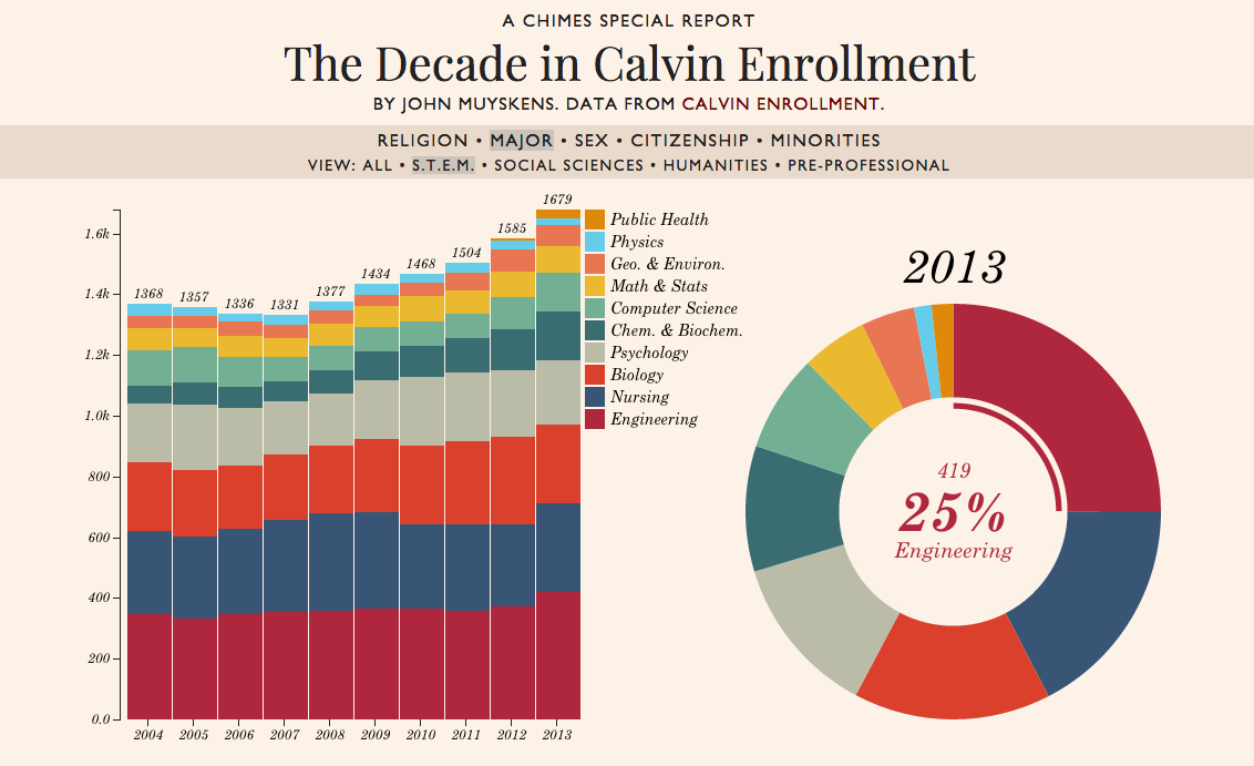
This interactive visualization of Calvin College’s Day 10 Report was my first major D3.js project. Calvin College releases a rich data set each year describing the state of the student body and faculty. Unfortunately, the format of this report is dry tables of numbers. My goal was to bring this data to life through colorful, interactive charts with animated transitions.
Looking back on this project, I’ve realized that the chart designs are naive. Bill Cleveland would disapprove of my use of “pop” charts - stacked bar and pie/donut charts. A big problem with these charts is that it is difficult to compare different segments to each other. In the stacked bar chart, it’s difficult to compare change over time in any section but the one on the bottom. To alleviate some of these problems, I allow the user to rearrange the chart by clicking on a section to send that category to the bottom of the chart. I also followed Cleveland’s recommendation to sort the sections in the donut chart by size. I acknowledge that these chart types are not the most effective graphical methods of conveying information.